Family Tree
A generational chart, not another Relationship Graph. Rows are generations — parents above children, spouses and siblings side by side in the same row — walked from directional parent, sibling and spouse connections, the kind of shape a physics-based web of every relationship in the project was never going to draw.
Getting there
Find it under Analysis in the binder sidebar, or in the Analysis menu. It used to carry the experimental label and sit under Labs; it no longer does — see The analysis tools for what that label means and which tool still has it.
Setting up the connections it reads
Three relationship types decide the generations: parent, sibling and spouse. Those are the ones that carry a generation, so those are the ones that place people above and beside each other. Add one from either person's own record: open Add Connection under Connections, pick the other person, then pick the relationship type — picking parent, sibling or spouse fills in its labels for you.
Every other tie still draws — it just doesn't move anyone. The older, symmetric family type ("is related to", no direction) and a romance not yet recorded as a marriage both draw as a connection between two people the chart has already placed, rather than vanishing from it. So does the rest of the relationship vocabulary — friendship, mentor, professional, history — none of which is gated behind a character's importance any more.
Use the link-type filter in the header to decide which of those non-family ties actually draw. It offers Show All Links, Hide All Links, and a checkbox for each type in use, so a chart that has turned into a thicket can be cut back to blood relations in two clicks. It has no effect on parent, sibling or spouse connections, which always draw.
When the kinship is in the label
The older, symmetric family type and romance carry no direction in the type itself — but writers routinely put the whole answer in the label they type, and the chart reads it. A family tie labelled son of, daughter of or child of is a parent-child connection with the direction the label states; father of, mother of and parent of the same the other way round; husband of, wife of and married to are a marriage; brother of and sister of are siblings. It reads the forward label — the sentence you see in the Connections list — so the chart and that sentence always agree.
This is deliberately narrow. Only those two undirected types are ever reread, only on a single unmistakable kinship word, and an explicit parent, sibling or spouse type always wins. Great-nephew of, mother-in-law of and is related to stay the undirected family links they always were, because none of them says which of two people came first.
People who are only there by association
A friend, a doctor, a neighbour — someone whose only tie into the family is one of the non-family types — is real enough to show, but no part of the generational structure. Rather than each taking a column of their generation's row, they stack in a single shared column beside whichever relative they attach to, however many of them there are. It says the truer thing about them: they orbit a person, they are not that person's contemporaries in the family.
Anyone with a real family tie of any kind, including a plain family one, keeps their place in the row.
Reading the chart
Each connected family draws as its own chart, stacked one above the next — a project with two unrelated families on the page (your protagonist's and, say, a rival's) draws two separate charts rather than forcing them into one shared layout. A record with none of the three relationship types on it doesn't appear on any chart at all.
A solid line connects a parent to a child, or joins a spouse or sibling pair in the same row. A dashed grey line means the surrounding relationships don't agree with each other at that connection — two different paths implying two different generations, or a straightforward data mistake like two records each marked as the other's parent. That's a signal to look at the relationships involved, not a rendering bug: the chart still places both ends somewhere, it just can't draw that one connection as if the data formed a clean tree there.
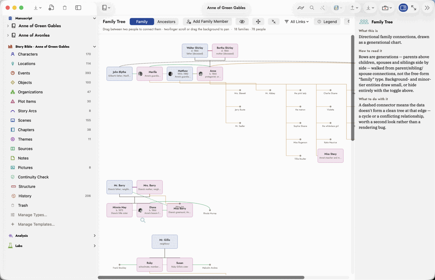 Both dashed styles on one chart: grey where the data
disagrees with itself, ochre for a real but non-family tie. The people on
the right orbit Jeffrey rather than taking a row of their own — see
"People who are only there by association," below.
Both dashed styles on one chart: grey where the data
disagrees with itself, ochre for a real but non-family tie. The people on
the right orbit Jeffrey rather than taking a row of their own — see
"People who are only there by association," below.
A card's accent colour comes from that character's own Gender field — blue, magenta, or a neutral grey when it isn't set — so the colour carries meaning rather than being a stable-but-arbitrary tint. The same reading decides which side each parent sits on in an Ancestors chart, below.
Gender is not an essential field, so a record that has never had one does not show it among the filled fields on the record panel. It appears there under The Analysis Can Fill These — which is where double-clicking a grey card takes you, and where typing Male or Female recolours the card without your leaving the chart.
How the automatic layout decides where everyone goes
Rows are generations and that never changes — it is the whole assertion the picture makes, and it is why this is not the Relationship Graph's spring simulation, which settles nodes wherever the physics puts them and would happily place a parent below their own child.
Within each row, two passes run. The first orders the row so parent-child lines stop crossing each other. The second nudges every group toward the average position of its own parents and children, repeatedly, until it settles — so a couple ends up centred over their children rather than wherever the row happened to reach them. Nobody is ever allowed to overlap anybody, and the result is the same every time for the same records.
Clicking a card opens that record, the same as everywhere else in the app.
The Legend button opens a key down the side of the chart: every card style, and every connector colour and dash pattern — the solid parent-to-child line, the heavier rose line for a spouse (carrying the marriage date along it when one is recorded), the thin sibling line, the sea-coloured family-or-romance tie, the dashed ochre used for whichever other connections the filter is letting through, and the dashed grey that marks a connection the data doesn't agree with.
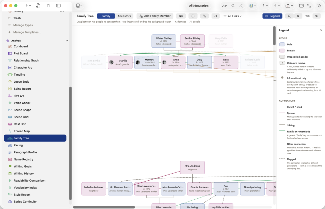 A key, not a settings sheet — nothing in the panel is
clickable except its own close button.
A key, not a settings sheet — nothing in the panel is
clickable except its own close button.
Background and minor characters
A large, imported-feeling family — more distant relatives than the book actually needs on the page — doesn't have to mean full-weight cards for everyone. Family Tree reads the same Importance field every record already carries, in its Classification section: Background or Minor tier draws as a small name-only label instead of a full card. Hide Informational, at the top of the chart, removes those entries from view entirely — turn it on for a chart that shows only who the book actually needs, and off again to see the fuller family it came from.
People you know exist but haven't named
Genealogy runs out before a family does. You know your protagonist had a grandmother on that side, and that is the whole of what you know. Add an unknown relative…, in a record's Add Connection menu, creates a stand-in for exactly that: a real record, holding a real relationship, drawn as a dashed card with a question mark and the subtitle Unknown relative. It keeps the shape of the family open at the point where your knowledge stops, instead of leaving a hole you have to remember.
Click one when you find out who they were, and a small sheet asks for the name. Filling it in renames the record in place — every connection already hanging off it stays exactly as it was.
Ancestors: one person's line, not the whole family
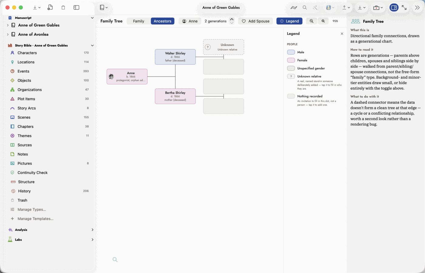
The Family / Ancestors switch at the top left changes the question being asked. Family mode draws the whole web, however it happens to be shaped. Ancestors is the narrow, strict version: pick one person and the chart draws a classic pedigree back from them — two parents, four grandparents, eight great-grandparents, each generation exactly double the last, every slot in a fixed place.
Two controls drive it. Choose Person picks whose line you are looking at, and a stepper sets how many generations back to draw, from two to eight.
Because the shape is fixed rather than grown from the data, the slots you have nothing for still draw — as empty boxes, not as gaps. That is the point of the mode: an empty box at one great-grandparent is a visible statement about what you haven't decided yet. Click one and Add Connection opens already set up for what that slot means, so filling in "the father's mother" doesn't require working out which way the relationship runs.
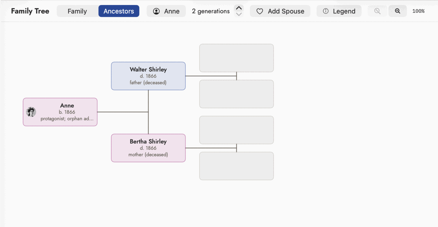 Every grandparent slot here is undecided, and each one
draws anyway.
Every grandparent slot here is undecided, and each one
draws anyway.
A pedigree has only one kind of line, so the Legend drops its connectors half in this mode and shows only the card styles.
Right-click anything on a pedigree and the menu answers what that box means. On a person: open them, chart their ancestors instead, add a parent, add a spouse, add a sibling, or manage their connections. On a blank slot: add the father or mother of whoever sits to its right, named as that. On empty space: the same three additions for the focus person.
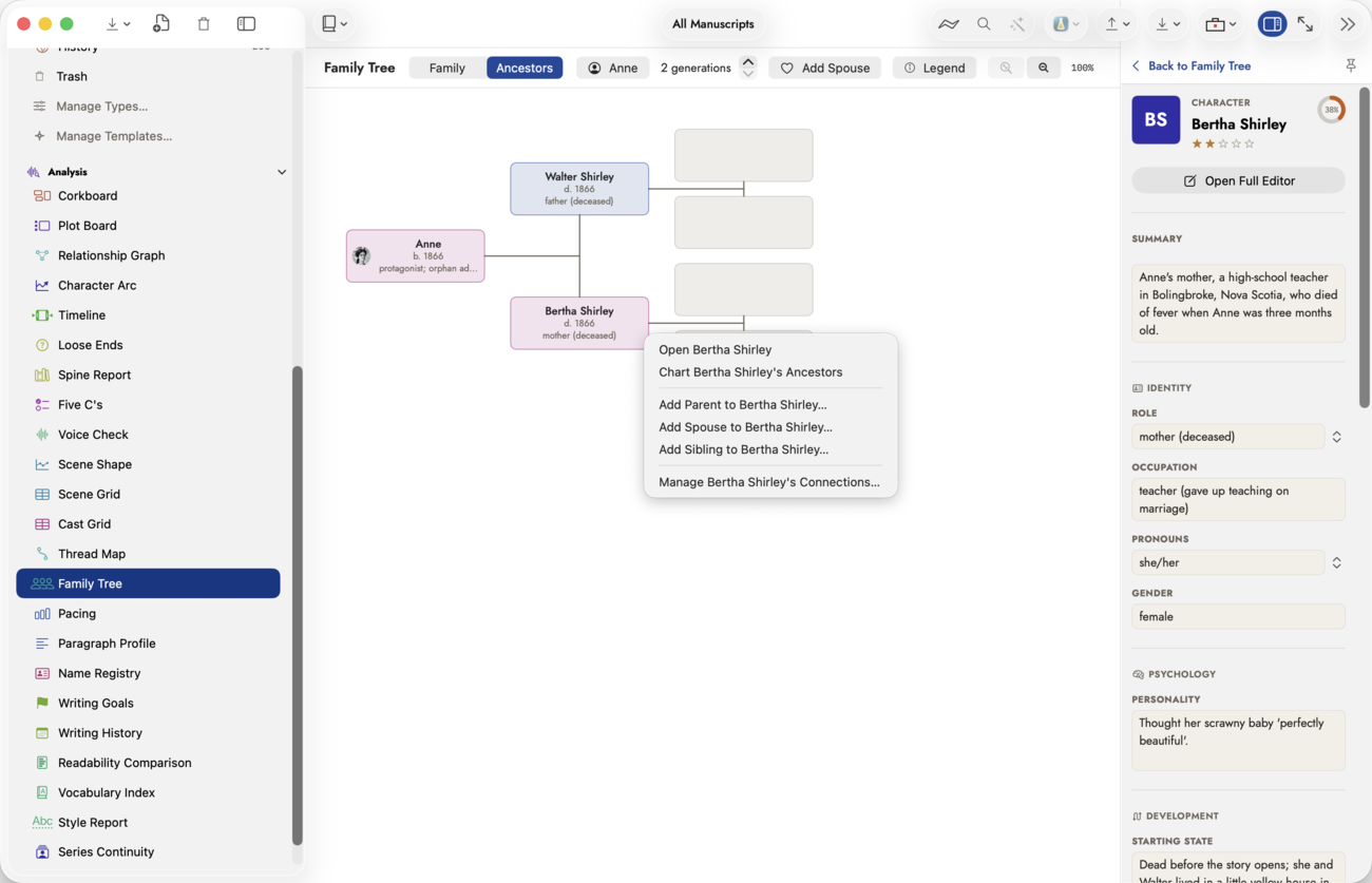 Every item names the person you right-clicked —
"Add Parent to Bertha Shirley…," never a bare "Add Parent…" — so a long
chain of these never leaves you guessing whose line you're extending.
Every item names the person you right-clicked —
"Add Parent to Bertha Shirley…," never a bare "Add Parent…" — so a long
chain of these never leaves you guessing whose line you're extending.
Getting around a large chart
Fit — the magnifier with arrows through it, left of the zoom controls. It scales the chart down until the whole thing is inside the space actually available and scrolls back to the top-left, so fits means all of it is on screen rather than merely small enough to be. It measures the real room rather than assuming it: the window, the binder, the inspector and the Legend panel all change it. It never zooms in past 100%, and greys out when the chart already fits.
Pan. Two-finger scroll on a trackpad, or drag the background between cards with a mouse. A drag that starts on a card still connects or moves it; only a drag that starts on empty canvas pans.
Zoom — minus and plus buttons sit either side of the current percentage; click the percentage itself to snap back to 100%. The level is remembered per project. Pinching on the chart zooms smoothly.
Hover to isolate. Pointing at a card lifts it and everyone it is directly connected to, dimming the rest. This is a pointer and trackpad affordance — nothing changes on a touch screen, which has no hover phase to work with.
Rearrange turns dragging into moving. Normally a drag from one card to another connects them, which is what you want while building a tree and exactly what you don't want while tidying one. Switch Rearrange on and a drag repositions the card instead, with every connector following it; the arrangement is remembered per project. Reset Positions, beside it, returns every hand-moved card to where the automatic layout would have put it.
Placeholder people
A slot and a placeholder are not the same blank. An empty slot is drawn by the chart itself, because a pedigree has a position nothing fills. A placeholder person is a real record you create on purpose, standing in for someone you know exists but cannot yet name. Make one from Add Parent — or Add Spouse, Add Sibling, Add Child — and choose Add an unknown relative… at the top of the candidate list instead of picking an existing record.
 Dashed border and a "?" where a portrait would
go, so a person you haven't identified never reads as one you've finished.
Naming it later is a rename, not a rebuild.
Dashed border and a "?" where a portrait would
go, so a person you haven't identified never reads as one you've finished.
Naming it later is a rename, not a rebuild.